Role
UX Design Intern
Duration
October 2023 - Present
Team
Senior Designer,
Development team
Context
SoundPub is a music distribution platform developed by Pison Contents that empowers musicians to manage and distribute their music efficiently. During a crucial restructuring phase aimed at scaling the platform, we identified several areas that required design and flow optimizations to improve usability and ensure a smoother experience for artists.
As a UX Design Intern, my role was centered on refining user flows and ensuring consistency across the platform. My responsibilities included thoroughly reviewing all user interactions and visual elements, with the goal of enhancing the overall user experience for musicians and streamlining their interactions with the platform.
SoundPub,
Simplifying Music Distribution
Simplifying
Music Distribution


Context
SoundPub is a music distribution platform developed by Pison Contents that empowers musicians to manage and distribute their music efficiently. During a crucial restructuring phase aimed at scaling the platform, we identified several areas that required design and flow optimizations to improve usability and ensure a smoother experience for artists.
As a UX Design Intern, my role was centered on refining user flows and ensuring consistency across the platform. My responsibilities included thoroughly reviewing all user interactions and visual elements, with the goal of enhancing the overall user experience for musicians and streamlining their interactions with the platform.
Role
UX Design Intern
Duration
October 2023 - Present
Team
Senior Designer,
Development team
Design Process
This project was carried out using an Agile methodology where design and development teams worked closely in parallel, constantly refining user flows based on ongoing feedback from both users and developers.
Iteration & Refinement
Ongoing Collaboration
Continuous Updates
Development Handoff
User Testing & Feedback
Iterative Testing
User Flow Adjustment
Testing & Adjustments
Prototyping & Design
Design Refinement
Prototyping Iterations
Design Refinement
Research & Ideation
Competitive Analysis
User Personas
User Feedback
Contributions
🔄 Flow Optimization
Optimized user flows by introducing confirmation pages and input validation.
🌟 Design Review
Reviewed designs to ensure usability, recommending changes such as notification order adjustments.
📋 Detail Checking
Ensured visual consistency with enhancements like "Select All" buttons and adjusted icons.
🤝 Collaboration with Development Team
Worked with developers to implement design changes, like resending codes during password recovery.
🔄 Flow Optimization
Goal: Enhance user flow by ensuring smooth and intuitive processes for key user actions.
Confirmation Dialogs: Introduced confirmation pages after major actions (signup, payment, music uploads) to reassure users that their actions were successfully completed, reducing confusion and increasing user confidence.
Input Validation: Implemented real-time error messages to guide users through mistakes, making corrections easy and ensuring a seamless experience.
Result: These improvements reduced confusion and anxiety, helping users feel more confident about completing key actions.
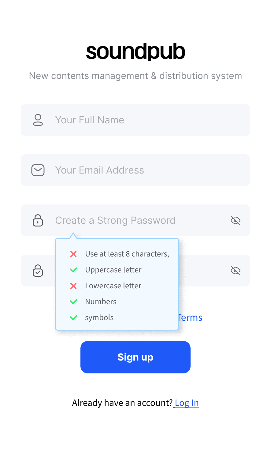

This refers to the process of checking and validating the user input when logging in to ensure the data entered is correct
Input validation during login


This refers to the process of checking and validating the user input when logging in to ensure the data entered is correct
Input validation during login
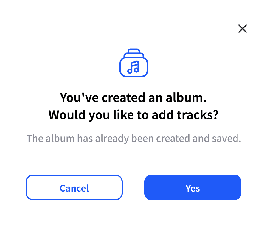

This appears after a user successfully registers an album, confirming that the process was completed successfully and reassuring the user that their submission was received.
Confirmation pop-up
after album registration
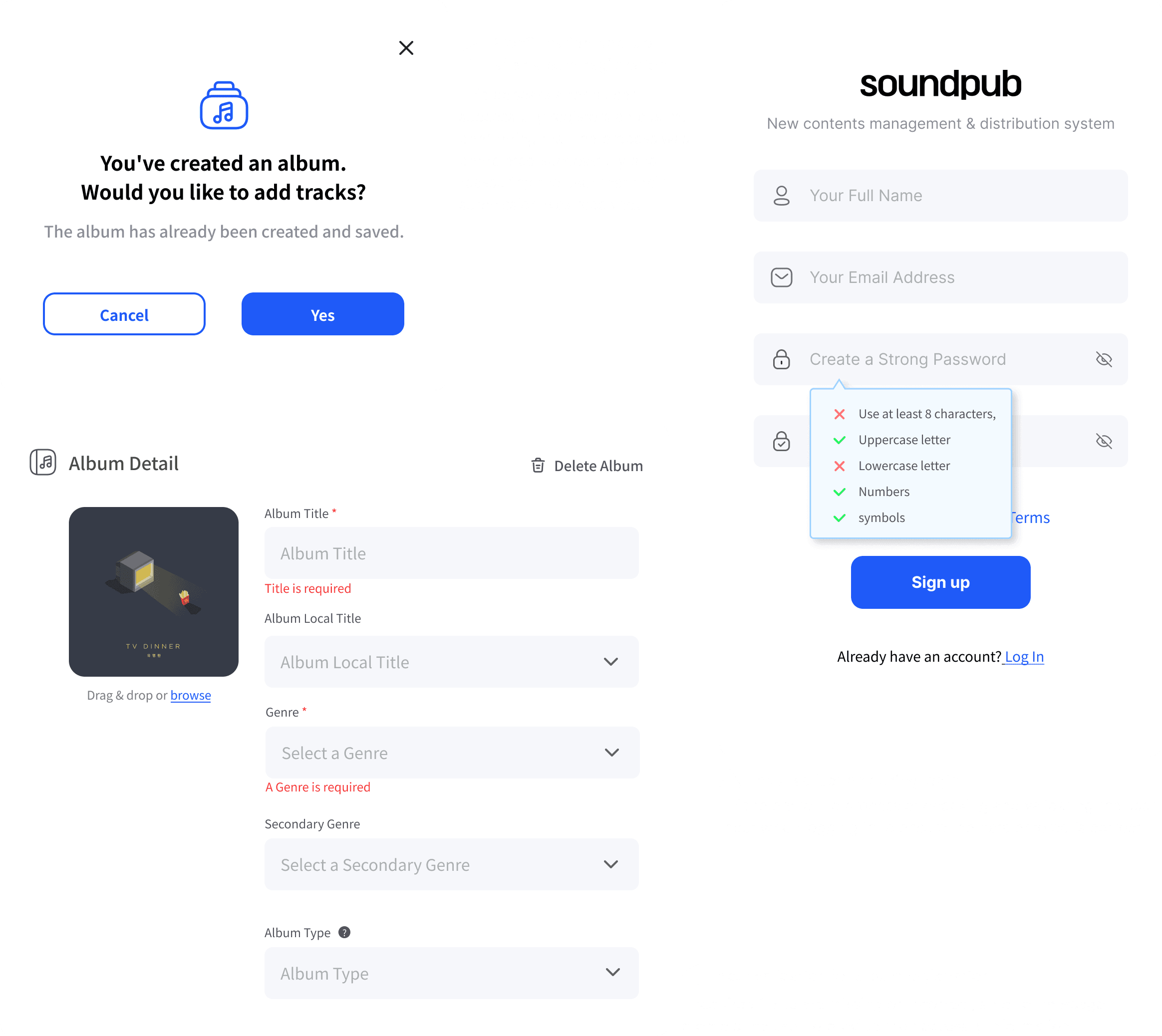
🌟 Design Review
Goal: Ensure the interface is intuitive, user-friendly, and consistent across the platform.
Notification Order Change: Proposed reordering notifications to display the latest alerts at the top, ensuring users see the most relevant information first.
Visual Consistency: Recommended design adjustments like button placements and color contrast to make the interface clearer and more accessible.
Result: The design became more intuitive and helped users access important information faster. Feedback from initial testing indicated users found the interface easier to navigate.


I improved the notification order so that the latest alerts are shown first, allowing for quicker access.


I enhanced visual consistency by implementing hover effects and color changes for album statuses, making the interface more intuitive and providing clear feedback for users.
📋 Detail Checking
Goal: Ensure all design elements align with the overall user experience and maintain consistency.
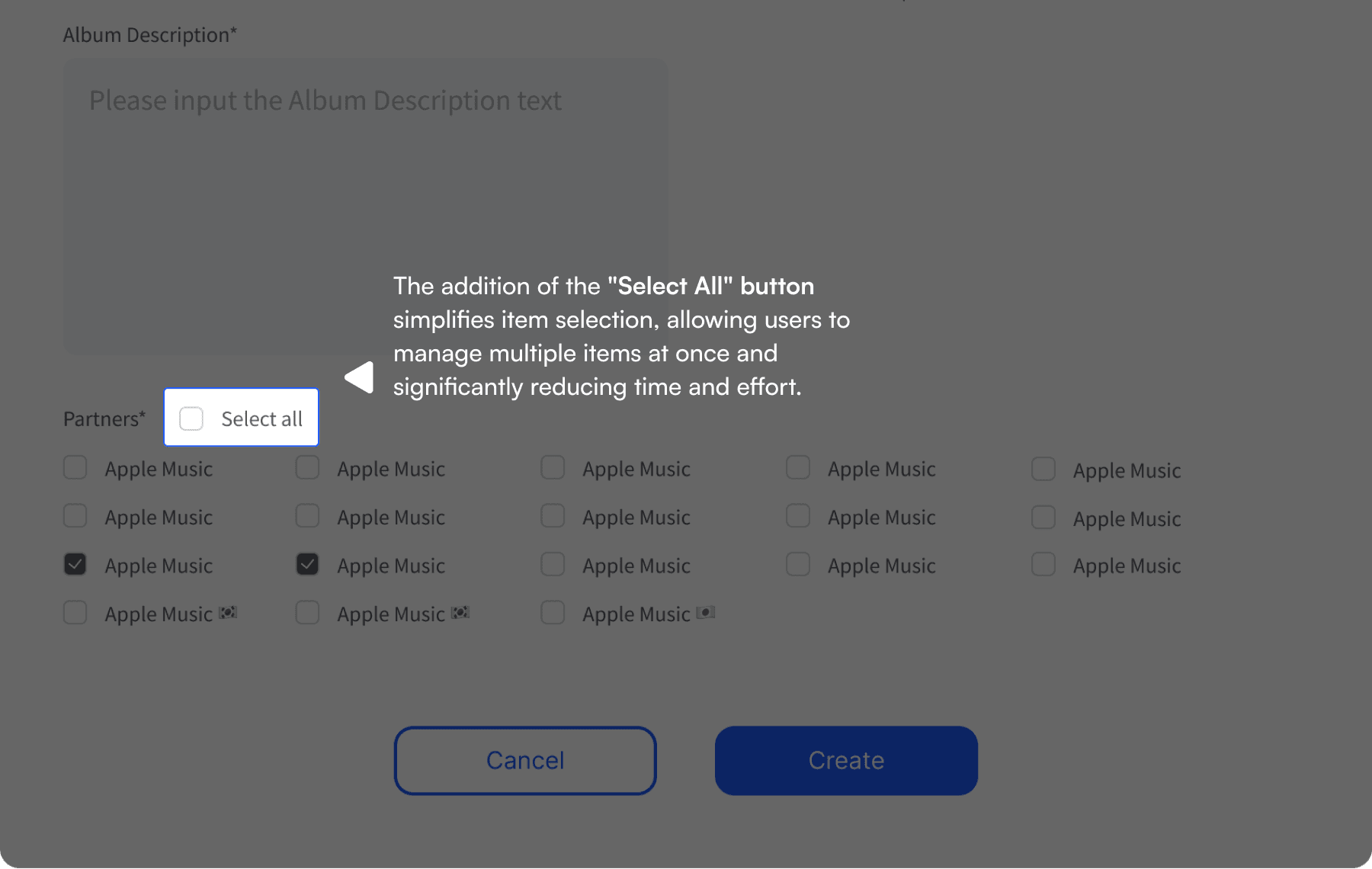
"Select All" Button: Added a “Select All” button to allow users to select all items at once, simplifying interaction and saving time.
Viewing Format Adjustments: Recommended that icons adjust automatically when the viewing format changes (e.g., table view to album view), maintaining visual consistency.
Result: This adjustment enhanced usability by reducing the time needed to manage items and maintaining visual coherence across the platform.
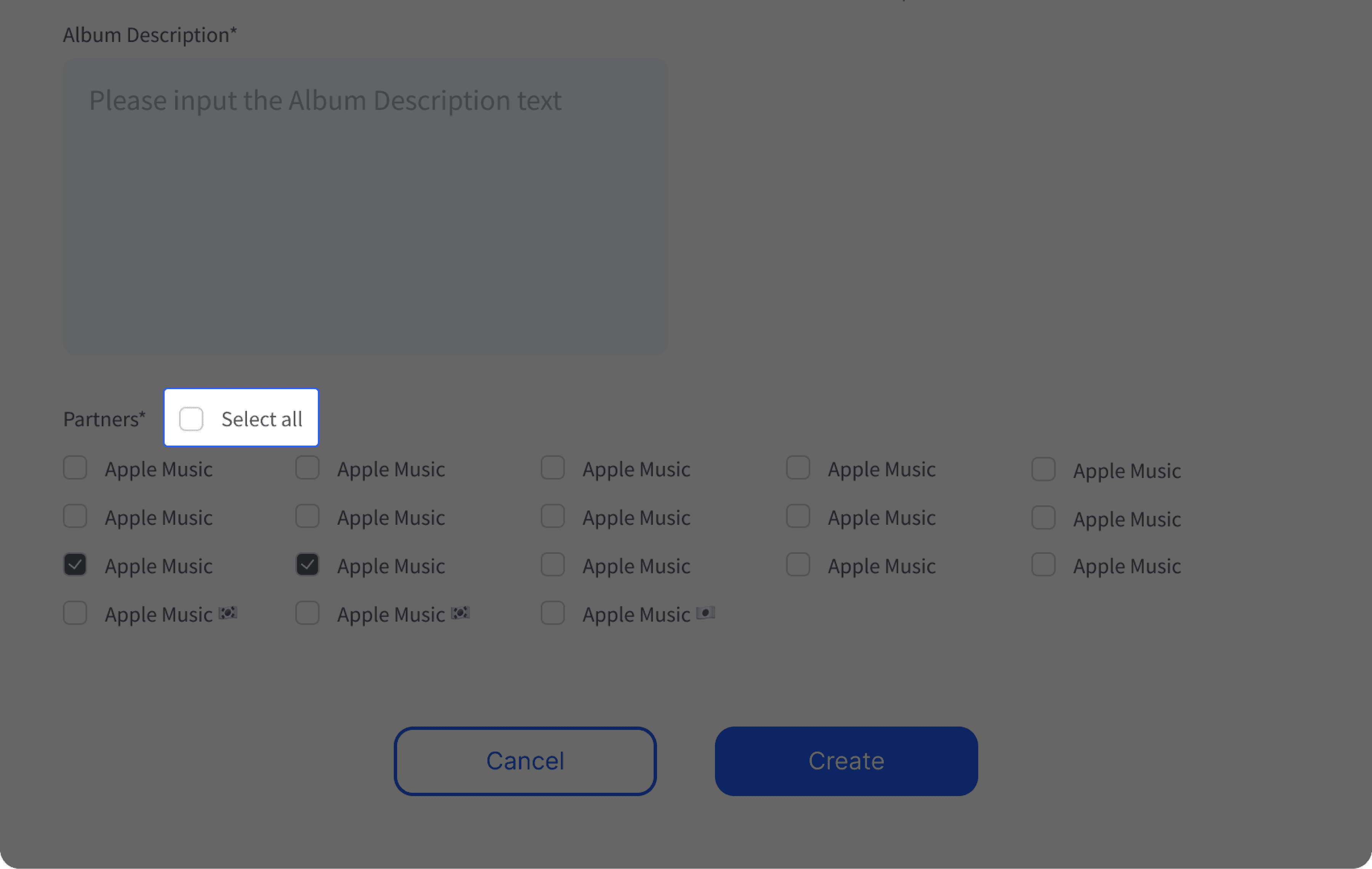

The addition of the "Select All" button simplifies item selection, allowing users to manage multiple items at once and significantly reducing time and effort.
🤝 Collaboration with Development Team
Goal: Ensure that design changes are technically feasible and effectively implemented by the development team.
Resend Code Option: Proposed the option to resend the code during password recovery instead of restarting the entire process, making the flow smoother and reducing frustration for users.
Sign-Up Prompt for Unregistered Emails: Suggested prompting users to sign up if they entered an unregistered email, encouraging user conversion and simplifying the process.
Result: These changes improved user retention and streamlined the user experience during account management.
During the password recovery process, I ensured the flow aligned with user convenience while maintaining secure handling of sensitive data.
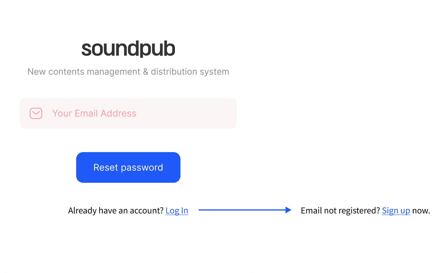

If the email is not registered, we agreed to prompt the user to sign up, guiding them smoothly through the process.


If the authentication code input time expired, we decided to allow the user to resend the code instead of restarting the entire process, ensuring a more efficient and user-friendly experience without compromising data security.
Reflection
Outcomes and Impact
Although the platform has not yet launched, my work has already led to several improvements that will have a direct impact on user experience. The addition of confirmation pages and real-time input validation will help reduce user anxiety, while the prioritization of notifications ensures that users stay informed about their most important actions.
By enhancing the overall user flow and making the platform more intuitive, my contributions will help musicians feel more confident and empowered when managing and distributing their music.
Key Learnings:
Meticulous Flow Analysis
This internship taught me the importance of scrutinizing every detail of the user flow. I became skilled at identifying potential obstacles in the user journey and proposing solutions that prevent users from encountering frustration. Through this process, I learned how to anticipate user behavior and design experiences that are as smooth and intuitive as possible.
I also learned the value of thinking through multiple user scenarios and considering how different users might interact with the platform. This experience helped me refine my ability to create user-centered solutions that are both functional and engaging.
Next Steps for SoundPub and My UX Journey
Currently, I am focused on developing a comprehensive design system for SoundPub, which will ensure consistency and scalability across the platform. This system will form the foundation for future updates, enabling more efficient design iterations and collaboration among team members.
As I move forward in my UX career, I am excited to apply the insights gained from this internship to create user-friendly solutions that improve user satisfaction and engagement. I look forward to continuing my growth in UX design, developing new skills, and contributing to impactful projects.
🌟 Design Review
Goal: Ensure the interface is intuitive, user-friendly, and consistent across the platform.
Notification Order Change: Proposed reordering notifications to display the latest alerts at the top, ensuring users see the most relevant information first.
Visual Consistency: Recommended design adjustments like button placements and color contrast to make the interface clearer and more accessible.
Result: The design became more intuitive and helped users access important information faster. Feedback from initial testing indicated users found the interface easier to navigate.

📋 Detail Checking
Goal: Ensure all design elements align with the overall user experience and maintain consistency.
"Select All" Button: Added a “Select All” button to allow users to select all items at once, simplifying interaction and saving time.
Viewing Format Adjustments: Recommended that icons adjust automatically when the viewing format changes (e.g., table view to album view), maintaining visual consistency.
Result: This adjustment enhanced usability by reducing the time needed to manage items and maintaining visual coherence across the platform.
🤝 Collaboration with Development Team
Goal: Ensure that design changes are technically feasible and effectively implemented by the development team.
Resend Code Option: Proposed the option to resend the code during password recovery instead of restarting the entire process, making the flow smoother and reducing frustration for users.
Sign-Up Prompt for Unregistered Emails: Suggested prompting users to sign up if they entered an unregistered email, encouraging user conversion and simplifying the process.
Result: These changes improved user retention and streamlined the user experience during account management.

Reflection
Outcomes and Impact
Although the platform has not yet launched, my work has already led to several improvements that will have a direct impact on user experience. The addition of confirmation pages and real-time input validation will help reduce user anxiety, while the prioritization of notifications ensures that users stay informed about their most important actions.
By enhancing the overall user flow and making the platform more intuitive, my contributions will help musicians feel more confident and empowered when managing and distributing their music.
Key Learnings: Meticulous Flow Analysis
This internship taught me the importance of scrutinizing every detail of the user flow. I became skilled at identifying potential obstacles in the user journey and proposing solutions that prevent users from encountering frustration. Through this process, I learned how to anticipate user behavior and design experiences that are as smooth and intuitive as possible.
I also learned the value of thinking through multiple user scenarios and considering how different users might interact with the platform. This experience helped me refine my ability to create user-centered solutions that are both functional and engaging.
Next Steps for SoundPub and My UX Journey
Currently, I am focused on developing a comprehensive design system for SoundPub, which will ensure consistency and scalability across the platform. This system will form the foundation for future updates, enabling more efficient design iterations and collaboration among team members.
As I move forward in my UX career, I am excited to apply the insights gained from this internship to create user-friendly solutions that improve user satisfaction and engagement. I look forward to continuing my growth in UX design, developing new skills, and contributing to impactful projects.